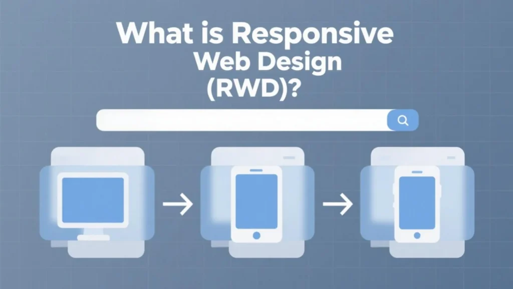
What Is Responsive Web Design (RWD)? Mobile-Friendly Layout Tips for WordPress Sites
In today’s digital age, websites are no longer just viewed on desktop computers. With the growing use of smartphones, tablets, and other smart devices, your website needs to look great and function properly on all screen sizes. This is where Responsive Web Design (RWD) comes in.
Responsive web design is not just a trendy term, it’s an essential approach to modern web development. In this article, we’ll explore what RWD is, why it’s important, and the key concepts you need to understand to create visually appealing and user friendly layouts for mobile phones and tablets.
What Is Responsive Web Design?

Responsive Web Design (RWD) is a design method that makes your website automatically adjust its layout, content, and elements to fit the screen size and resolution of the device being used. Whether someone is visiting your site from a desktop, a tablet, or a smartphone, a responsive site will provide a smooth and consistent user experience.
In short, RWD means “one website that works everywhere.”
Why Is RWD Important?
Mobile Usage Is Rising
More than 50% of global website traffic comes from mobile devices. If your site isn’t mobile friendly, you’re likely losing a large number of visitors.
Better User Experience (UX)
A responsive site provides a seamless browsing experience, improving user satisfaction and encouraging users to stay longer and return more often.
SEO Benefits
Google prioritizes mobile-friendly websites in search results. Responsive design can help improve your ranking and visibility on search engines.
Higher Conversion Rates
A site that works well on mobile devices often leads to better engagement and more conversions, whether that means sales, sign-ups, or other goals.
Easier Maintenance
Instead of managing separate websites for desktop and mobile, you only need to maintain one responsive site.
Key Concepts of Responsive Design for Mobile and Tablet Layouts
1. Fluid Grids and Flexible Layouts
A responsive design uses a fluid grid system instead of fixed-width layouts. This means elements on the page are sized in relative units (like percentages) rather than fixed units (like pixels). The layout will scale proportionally to the screen size.
📌 Example:
Instead of using width: 400px, use width: 50%.
2. Media Queries
Media queries are a powerful feature in CSS that allow your website to apply different styles depending on the device’s screen size or orientation.
With media queries, you can control what happens to your layout at specific breakpoints, such as:
- Small screens: smartphones (320px–480px)
- Medium screens: tablets (481px–768px)
- Large screens: desktops (769px and up)
3. Flexible Images and Videos
Images and videos should resize correctly with the layout. Use CSS to make media elements responsive:
img {
max-width: 100%;
height: auto;
}
This ensures they scale within their parent containers and do not overflow or distort.
4. Mobile-First Design
Mobile first means designing your website starting from the smallest screen size. It ensures that your content is optimized for mobile users first and then scales up for tablets and desktops.
It also helps improve performance and accessibility on mobile devices.
5. Navigation Optimization
Navigation is one of the most critical elements on a mobile site. Use:
- Hamburger menus
- Drop-down lists
- Sticky headers
- Clear, tappable buttons
Make sure your navigation is simple and thumb friendly.
6. Typography and Readability
Avoid small fonts on mobile. Use:
- Font sizes of at least 16px for body text
- Line spacing (
line-height) to improve readability - Adequate padding and spacing between clickable elements
7. Touch-Friendly Design
Mobile users rely on touch gestures. Design buttons and interactive elements with enough size and space to avoid mis-taps. A good rule of thumb is to make tap targets at least 44px by 44px.
Tools to Test Responsive Design
- Google Mobile-Friendly Test – https://search.google.com/test/mobile-friendly
- Responsively App – Free desktop app for previewing responsive designs
- Chrome DevTools – Built-in developer tool to simulate different screen sizes
Common Mistakes to Avoid
- Using fixed width containers that don’t adapt
- Forgetting to test on real devices
- Hiding too much content on smaller screens
- Not optimizing images for mobile
- Having buttons or links too close together
Responsive Web Design is no longer optional, it’s a must-have for any modern website. It’s about respecting your users’ needs across all devices, providing a consistent and beautiful experience, and ensuring that your site performs well on mobile, tablet, and desktop screens.
By understanding and applying key concepts like fluid grids, media queries, flexible images, and mobile-first design, you’ll be able to build a site that not only looks great but also works seamlessly for everyone.
Whether you’re a beginner or an experienced developer, mastering responsive design is one of the smartest things you can do for your website’s success.
#ResponsiveWebDesign #WebDesignTips #MobileFirstDesign #UXDesign #WordPressDesign